EdTech AI Startup Website Design: A Complete Guide
Why Website Design Matters for EdTech AI Startups
A website is often the first impression people get of your startup. Good design helps build trust from the very start.
EdTech AI startups deal with two challenges at once. They need to explain complex technology while keeping things simple for parents, students, and teachers.
A poorly designed website can confuse visitors quickly. If people don’t understand your product fast, they leave and never come back.
Good design also builds credibility. Clean layouts and clear messaging make your startup look professional and trustworthy.
Website design affects conversions too. Whether you want sign-ups or demo requests, design guides users toward that action.
In a competitive EdTech space, design can set you apart. It’s often the difference between a visitor exploring further or leaving immediately.
Core Elements Every EdTech AI Website Needs
Certain elements make an EdTech AI website work well. These basics help visitors understand your product quickly.
Clear Value Proposition Above the Fold
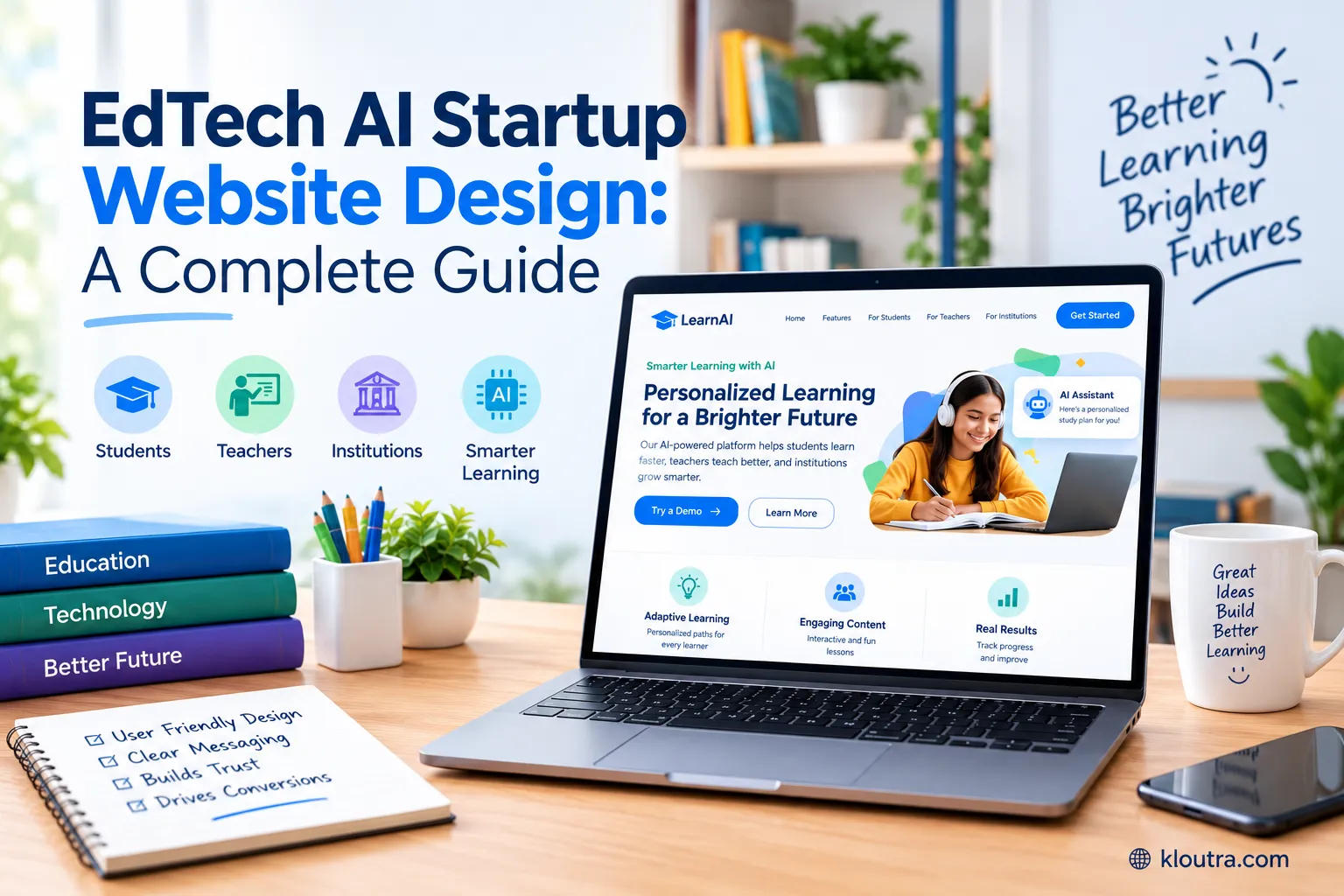
Your value proposition should appear right away, without scrolling. Visitors need to know what you offer within seconds. Keep the message simple and direct.
Explain what your product does and who it helps. Avoid technical jargon in this section. Parents, teachers, and students should understand it instantly.
A strong headline paired with a short description works best. This combo gives visitors a quick, clear introduction to your startup.
Product Demo or Interactive Preview
A demo helps visitors see your product in action. This builds trust faster than text alone. Interactive previews work especially well for AI tools.
They let users explore features without signing up first. Keep demos short and focused. Highlight the most useful or unique parts of your product.
This section often turns curious visitors into serious leads. Seeing the product work builds confidence in what you’re offering.
Trust Signals and Social Proof
Trust signals help reassure visitors that your startup is credible. This matters even more for AI-based education tools. Include testimonials from teachers, students, or institutions you’ve worked with.
Real feedback builds trust quickly. Logos of partner schools or organizations also help. They show your product is already being used successfully.
Certifications, awards, or media mentions add extra credibility. These small details can influence a visitor’s decision to try your product.
Choosing the Right Layout and Structure
A clear layout helps visitors find what they need quickly. Good structure keeps your website easy to use for everyone.
Homepage Design Best Practices
Your homepage should give a quick overview of your product. Keep the design clean and avoid clutter. Use clear sections that guide visitors step by step.
Start with your value proposition, then show features, then proof. Add strong calls to action throughout the page. Buttons like “Try a Demo” or “Get Started” should stand out clearly.
Keep load times fast. A slow homepage can cause visitors to leave before they even see your product.
Navigation That Guides Users Naturally
Simple navigation helps visitors move through your site easily. Avoid too many menu options that can cause confusion. Group pages into clear categories, like Product, Pricing, and Resources.
This keeps the structure easy to follow. Use descriptive labels instead of vague terms. Visitors should know exactly what each page offers before clicking.
A sticky navigation bar can also help. This keeps menu options visible as users scroll through longer pages.
Landing Pages for Different User Types (Students, Teachers, Institutions)
Different users have different needs on your website. Separate landing pages help address these needs directly.
A student-focused page should highlight ease of use and learning benefits. Keep the tone simple and encouraging.
A teacher-focused page can highlight classroom tools and time-saving features. Focus on how the product supports daily teaching tasks.
An institution-focused page should highlight scalability, data security, and support options. Decision-makers often look for reliability and long-term value here.
Design Principles That Build Trust and Credibility
Certain design choices help visitors trust your website faster. These principles matter even more for AI and education brands.
Color Psychology for Education and AI Brands
Colors can influence how visitors feel about your brand. Blue is often linked with trust and reliability, which fits AI products well. Green can suggest growth and learning, making it popular in EdTech design.
It feels calm and supports a focused, educational tone. Avoid using too many colors at once. This can make your website feel chaotic instead of professional.
Stick to a simple color palette with one or two main colors. This keeps the design consistent and easy on the eyes.
Typography That Feels Modern Yet Approachable
Font choice affects how easy your website is to read. Clean, sans-serif fonts often feel modern and simple. Avoid overly decorative fonts for body text. These can slow down reading and feel less professional.
Keep font sizes readable across devices. Text that’s too small can frustrate users, especially on mobile screens.
Use consistent spacing between lines and paragraphs. This makes long sections of text easier to scan and understand.
Using Real Data and Case Studies
Real data helps prove your product works. This builds stronger trust than generic claims alone. Share simple statistics, like improved learning outcomes or time saved.
Keep numbers clear and easy to understand. Case studies add more depth to your claims. Highlight specific schools, teachers, or students who benefited from your product.
Keep case studies short and focused. Highlight the problem, the solution, and the results in a few clear sentences.
User Experience (UX) Best Practices
Good UX keeps visitors engaged and reduces frustration. Small design choices can make a big difference in usability.
Simplifying Onboarding and Sign-Up Flows
A simple sign-up process encourages more people to try your product. Long forms often cause visitors to give up early. Ask for only essential information at first.
You can collect more details later, once users are engaged. Break onboarding into small, clear steps. This feels less overwhelming than one long, complicated process.
Add progress indicators during sign-up. This helps users know how much longer the process will take.
Mobile Responsiveness for Students and Educators
Many students and teachers browse on mobile devices. Your website needs to work well on smaller screens.
Use responsive design so layouts adjust automatically. This keeps text, buttons, and images easy to use on any device.
Avoid tiny buttons or text that’s hard to tap. Mobile users need larger, clearly spaced elements for easy navigation.
Test your website on different screen sizes regularly. This helps catch issues before they affect real users.
Accessibility Standards for Educational Platforms
Accessibility ensures your website works for all users, including those with disabilities. This is especially important for educational platforms.
Use clear color contrast so text remains readable. This helps users with visual impairments navigate your site easily.
Add alt text to images for screen readers. This ensures visually impaired users understand your content fully.
Follow accessibility guidelines like WCAG standards. Following the guidelines makes your website legally sound and more inclusive.
Showcasing AI Features Without Overwhelming Visitors
AI features can feel complex to explain. The goal is to highlight them clearly without confusing visitors.
Visualizing How the AI Works
Visuals help explain AI features better than long paragraphs. Simple diagrams or short animations can show how the process works.
Use step-by-step graphics to break down complex actions. This helps visitors follow along without feeling lost. Short video clips can also work well. They show real examples of the AI in action.
Keep visuals clean and uncluttered. Too much detail in one image can confuse more than it helps.
Balancing Technical Detail With Simplicity
Not every visitor needs deep technical details. Focus on what the AI does, not just how it works internally. Use simple language to describe complex processes.
Avoid heavy jargon that non-technical users won’t understand. Offer more detailed information for those who want it. A separate page or expandable section works well for this.
Keep the main message focused on benefits. Visitors care more about results than the technical process behind them.
Essential Pages Your EdTech AI Website Should Have
Certain pages help visitors understand and trust your startup. These pages support both new visitors and returning users.
About and Mission Page
An about page helps visitors connect with your brand’s story. Explain why you started the company and what problem you’re solving.
Keep the tone honest and simple. Avoid overly formal language that feels distant from readers Include information about your team if possible.
This adds a human touch and builds trust. Highlight your mission clearly. Visitors want to know what values guide your product decisions.
Pricing and Plans Page
A clear pricing page helps visitors make quick decisions. Confusing pricing often leads to visitors leaving your site. List your plans in a simple, easy-to-compare format.
Highlight key features included in each plan. Avoid hidden fees or unclear terms. Transparency builds trust, especially for schools and institutions.
If pricing varies by user type, explain this clearly. Separate options for individuals, teachers, or institutions can help.
Blog and Resource Center
A blog helps establish your startup as a trusted source. It also supports your SEO efforts over time. Share helpful content related to education and AI trends.
This keeps your audience engaged beyond just your product. A resource center can include guides, FAQs, or tutorials. This supports both new users and existing customers.
Update content regularly. Fresh, relevant content keeps visitors returning to your website.
SEO and Performance Considerations for EdTech Startups
SEO and performance both affect how visitors find and use your website. Ignoring either can hurt your traffic and user experience.
Page Speed and Core Web Vitals
Page speed affects both rankings and user experience. Slow websites often lose visitors before they even load fully.
Google measures speed using Core Web Vitals. This includes loading speed, responsiveness, and visual stability. Interaction to Next Paint (INP) replaced First Input Delay as the responsiveness metric in March 2024.
A good score for loading speed is 2.5 seconds or less. A good score for responsiveness is 200 milliseconds or less. Visual stability should score 0.1 or less for a good result.
Compress images and avoid unnecessary scripts to improve speed. Choose reliable hosting for consistent performance across devices.
On-Page SEO for Education Keywords
On-page SEO helps your website rank for relevant search terms. This brings in visitors who are already interested in your product. Use clear, descriptive titles and headings.
Include education and AI-related keywords naturally throughout your content. Write helpful meta descriptions for each page. This improves click-through rates from search results.
Optimize page URLs to be short and readable. Avoid long, complicated links that confuse both users and search engines.
Common Website Design Mistakes EdTech Startups Make
A few common mistakes can hurt an EdTech website’s performance. Avoiding these helps keep your site effective and user-friendly.
1. Overloading the Homepage With Information
Too much text or too many features can overwhelm visitors. Keep the homepage focused on your main message.
2. Using Too Much Technical Jargon
Complex AI terms can confuse non-technical visitors. Explain features in simple, everyday language instead.
3. Ignoring Mobile Users
Many students and teachers browse on phones. A website that isn’t mobile-friendly loses these visitors quickly.
4. Slow Page Load Times
Visitors often leave slow-loading websites before they even see your content. Optimize images and scripts to keep pages fast.
5. Weak or Unclear Calls to Action
Vague buttons like “Learn More” don’t guide visitors well. Use clear actions like “Try a Free Demo” instead.
6. Skipping Trust Signals
Websites without testimonials or partner logos can feel less credible. Include real proof to build visitor confidence.
7. Poor Navigation Structure
Confusing menus make it hard for visitors to find key pages. Keep navigation simple and well-organized.
Tools and Platforms to Build an EdTech AI Website
Choosing the right platform depends on your team’s skills and your website’s needs. Several tools work well for EdTech startups.
Webflow is a strong choice for design-focused teams. It offers full visual control along with a built-in CMS for managing content like blog posts and case studies.
WordPress remains a popular option for content-heavy websites. It offers thousands of plugins, strong SEO tools, and long-term flexibility as your startup grows.
Framer works well for early-stage startups needing quick, professional landing pages. It’s especially useful for pre-seed or early MVP websites.
Wix Studio suits teams that want a balance of design flexibility and ease of use. It includes built-in SEO tools and responsive design features.
HubSpot CMS works well for startups focused on marketing and lead generation. It combines website building with built-in marketing automation tools.
Your choice should match your startup’s stage and technical skills. Prioritize platforms that support scalability, mobile responsiveness, and simple content management.
Frequently Asked Questions
What makes EdTech AI website design different from regular website design?
It needs to explain complex AI features in simple terms. The design must build trust for both individual users and institutions.
Do EdTech AI websites need separate pages for students, teachers, and institutions?
Yes, this is highly recommended. Different users have different needs, so separate landing pages help address them directly.
How important is mobile responsiveness for EdTech websites?
It’s very important. Many students and teachers access these platforms through mobile devices, so the design must work well on smaller screens.
Should EdTech AI websites include a product demo?
Yes, a demo or interactive preview helps visitors understand your product quickly. It builds trust faster than text alone.
What page speed should EdTech websites aim for?
Aim for a Largest Contentful Paint under 2.5 seconds. Faster pages improve both user experience and search rankings.
Which website builder is best for an EdTech AI startup?
It depends on your stage and needs. Webflow suits design-focused teams, while WordPress works well for content-heavy sites.
Final Thoughts
A well-designed website helps your EdTech AI startup build trust quickly. It’s often the first real interaction visitors have with your brand.
Clear messaging, simple navigation, and strong visuals all work together. These elements help visitors understand your product without feeling overwhelmed.
Good design also supports long-term growth. It improves conversions, builds credibility, and keeps your startup competitive in a crowded market.
In the end, your website should feel as smart and simple as your product. That balance is what turns visitors into loyal users.
Disclaimer:
This article is for informational purposes only. It does not constitute technical, legal, or professional design advice. Tool recommendations, pricing, and market data mentioned are based on publicly available information at the time of writing and may change. Always verify current features and pricing directly with each platform before making a decision.