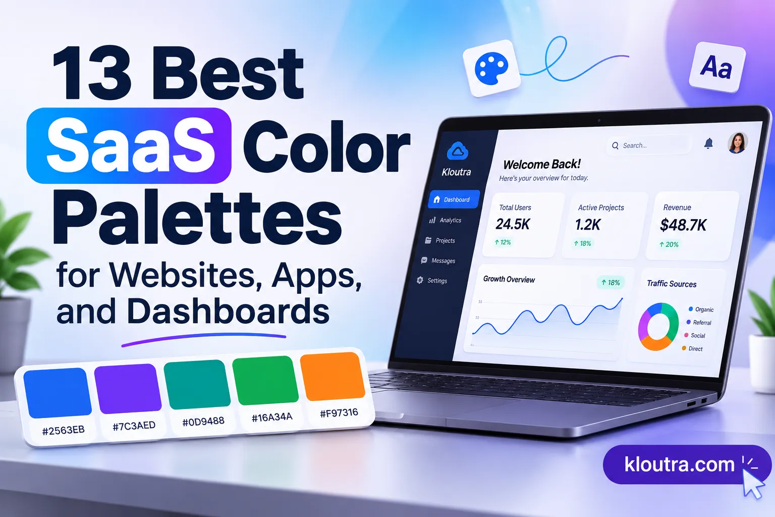
13 Best SaaS Color Palettes for Websites, Apps, and Dashboards
Choosing the right colors for a SaaS product is not just about appearance. Your color palette affects how users recognize your brand, read information, and interact with your software.
A good combination makes your website look professional and your dashboard easier to use. It also creates a consistent experience across buttons, navigation, forms, and charts. But finding the right colors can be difficult. You need a combination that suits your brand, works across different screens, and keeps important information readable.
Here are 13 SaaS color palettes with HEX codes, practical uses, and design tips to help you choose the right combination.
13 Best SaaS Color Palettes
1. Modern Blue and White
<AsyncImage query=”modern blue white SaaS dashboard UI color palette clean CRM software interface” aspectRatio=”16:9″/>
| Color | HEX Code |
|---|---|
| Primary Blue | #2563EB |
| Dark Navy | #1E293B |
| Light Blue | #DBEAFE |
| Background | #F8FAFC |
| White | #FFFFFF |
This palette gives software a clean, professional appearance. Blue creates a clear brand identity, while white and light blue keep the interface simple.
Best for: CRM platforms, project management tools, business dashboards, and productivity software.
Use blue for primary buttons and active navigation. Keep content areas light to make information easy to scan.
2. Navy and Electric Blue
<AsyncImage query=”dark navy electric blue modern SaaS analytics dashboard UI” aspectRatio=”16:9″/>
| Color | HEX Code |
|---|---|
| Deep Navy | #0F172A |
| Electric Blue | #3B82F6 |
| Slate | #334155 |
| Light Gray | #E2E8F0 |
| White | #FFFFFF |
Navy creates a strong foundation, while electric blue highlights important elements. This combination works well for software with a technical or business-focused identity.
Best for: Developer tools, analytics software, enterprise platforms, and SaaS landing pages.
Use navy for navigation and large sections. Reserve electric blue for buttons, links, and selected interface elements.
3. Purple and Soft Lavender
<AsyncImage query=”purple lavender SaaS app dashboard modern AI software interface” aspectRatio=”16:9″/>
| Color | HEX Code |
|---|---|
| Primary Purple | #7C3AED |
| Deep Purple | #4C1D95 |
| Lavender | #EDE9FE |
| Soft Gray | #F5F3FF |
| White | #FFFFFF |
Purple adds personality without making a software interface feel overly colorful. Lavender creates softer backgrounds for cards and supporting content.
Best for: AI tools, creative software, marketing platforms, and design applications.
Use purple for primary actions and brand elements.
4. Green and Charcoal
<AsyncImage query=”green charcoal finance SaaS dashboard business analytics interface” aspectRatio=”16:9″/>
| Color | HEX Code |
|---|---|
| Primary Green | #16A34A |
| Dark Green | #14532D |
| Charcoal | #1F2937 |
| Light Green | #DCFCE7 |
| Off-White | #F9FAFB |
Green creates a fresh appearance, while charcoal keeps the design professional. This combination works particularly well for software that handles business data.
Best for: Accounting software, finance platforms, sustainability tools, and business applications.
Use green for primary actions and positive status indicators. Do not rely on green alone to communicate success.
5. Teal and Slate
<AsyncImage query=”teal slate healthcare SaaS software dashboard clean interface” aspectRatio=”16:9″/>
| Color | HEX Code |
|---|---|
| Primary Teal | #0D9488 |
| Deep Teal | #134E4A |
| Slate | #334155 |
| Pale Teal | #CCFBF1 |
| White | #FFFFFF |
Teal offers a modern alternative to traditional blue palettes. It creates a calm appearance while maintaining a clear visual identity.
Best for: Healthcare software, customer support platforms, workflow tools, and business applications.
Use teal for buttons and selected navigation.
6. Orange and Midnight Blue
<AsyncImage query=”orange midnight blue SaaS sales marketing dashboard modern interface” aspectRatio=”16:9″/>
| Color | HEX Code |
|---|---|
| Primary Orange | #F97316 |
| Midnight Blue | #172554 |
| Light Orange | #FFEDD5 |
| Slate | #475569 |
| White | #FFFFFF |
Orange adds energy, while midnight blue creates a strong visual foundation. This combination helps important elements stand out.
Best for: Sales software, marketing tools, startup websites, and customer engagement platforms.
Use orange for selected calls to action. Keep large content areas neutral to avoid overwhelming users.
7. Minimal Black and White
<AsyncImage query=”minimal black white SaaS dashboard interface clean productivity software” aspectRatio=”16:9″/>
| Color | HEX Code |
|---|---|
| Black | #111827 |
| White | #FFFFFF |
| Light Gray | #F3F4F6 |
| Medium Gray | #9CA3AF |
| Dark Gray | #374151 |
This palette keeps the interface simple and puts the focus on the product. It works especially well when users spend long periods reading or working inside the software.
Best for: Developer tools, document software, productivity apps, and minimalist SaaS websites.
Use black for headings and primary text. Light gray can separate sections without adding unnecessary color.
8. Sky Blue and Soft Gray
<AsyncImage query=”sky blue soft gray cloud SaaS dashboard UI clean modern software” aspectRatio=”16:9″/>
| Color | HEX Code |
|---|---|
| Primary Sky Blue | #0284C7 |
| Dark Blue | #075985 |
| Pale Blue | #E0F2FE |
| Soft Gray | #F1F5F9 |
| White | #FFFFFF |
Sky blue creates a lighter appearance than traditional navy-based palettes. Soft gray keeps the interface organized and easy to scan.
Best for: Cloud software, collaboration tools, education platforms, and SaaS websites.
Use sky blue for buttons and links.
9. Coral and Deep Navy
<AsyncImage query=”coral pink deep navy SaaS marketing dashboard modern UI design” aspectRatio=”16:9″/>
| Color | HEX Code |
|---|---|
| Coral | #F43F5E |
| Deep Navy | #1E1B4B |
| Soft Pink | #FFE4E6 |
| Light Gray | #F8FAFC |
| White | #FFFFFF |
Coral gives a brand a distinctive appearance. Deep navy balances its brightness and makes the combination suitable for professional software.
Best for: Marketing platforms, social media tools, customer experience software, and creative SaaS products.
Use coral for selected buttons and highlights.
10. Indigo and Cool Gray
<AsyncImage query=”indigo cool gray project management SaaS dashboard modern interface” aspectRatio=”16:9″/>
| Color | HEX Code |
|---|---|
| Primary Indigo | #4F46E5 |
| Deep Indigo | #312E81 |
| Light Indigo | #E0E7FF |
| Cool Gray | #F3F4F6 |
| White | #FFFFFF |
Indigo combines the professional feel of blue with the creative character of purple. Cool gray keeps the interface balanced.
Best for: Project management tools, team collaboration apps, and productivity software.
Use indigo for primary buttons and active navigation.
11. Warm Beige and Forest Green
<AsyncImage query=”warm beige forest green SaaS wellness business software dashboard” aspectRatio=”16:9″/>
| Color | HEX Code |
|---|---|
| Forest Green | #166534 |
| Dark Green | #14532D |
| Warm Beige | #F5F0E8 |
| Sand | #E7DCCB |
| Dark Brown | #292524 |
This palette offers a softer alternative to common software colors. Beige adds warmth, while forest green provides a strong brand accent.
Best for: Sustainability software, wellness platforms, lifestyle applications, and eco-focused businesses.
Use beige for backgrounds and green for primary actions. Keep dark brown for readable text.
12. Cyan and Dark Navy
<AsyncImage query=”cyan dark navy cybersecurity developer SaaS dashboard interface” aspectRatio=”16:9″/>
| Color | HEX Code |
|---|---|
| Primary Cyan | #06B6D4 |
| Dark Navy | #0F172A |
| Deep Cyan | #155E75 |
| Light Cyan | #CFFAFE |
| White | #FFFFFF |
Cyan creates a modern digital appearance. Dark navy provides contrast and keeps bright accents under control.
Best for: cybersecurity tools and cloud services.
Use cyan for active navigation and selected controls. Avoid using bright cyan for large blocks of body text.
13. Dark Mode Purple and Blue
<AsyncImage query=”dark mode purple blue AI SaaS dashboard interface dark background” aspectRatio=”16:9″/>
| Color | HEX Code |
|---|---|
| Background | #0B1020 |
| Surface | #151B2E |
| Primary Purple | #8B5CF6 |
| Accent Blue | #38BDF8 |
| Main Text | #F8FAFC |
This palette is designed for dark interfaces. The dark background creates depth, while purple and blue provide visual accents.
Best for: AI dashboards, developer tools, analytics platforms, and advanced productivity software.
Use the darkest shade for the main background and the surface color for cards. Reserve purple and blue for buttons and selected elements.
How to Choose a SaaS Color Palette
You do not need dozens of colors to create a professional software interface. Start with a simple system that supports your brand and product.
Choose a Primary Color
Pick one color that represents your brand. Blue, purple, green, and teal are useful starting points, but your choice should reflect your product and audience. Use the primary color consistently for important actions and brand elements.
Add Neutral Colors
Choose background, text, and border colors that work with your primary shade. Neutral colors help keep dashboards readable, especially when they contain tables, forms, and charts.
Create Light and Dark Variants
If your product supports light and dark modes, define separate colors for each theme. Do not simply invert the colors. Check backgrounds, text, borders, buttons, and charts in both modes.
Test Your Palette in the Actual Interface
Preview your colors on real buttons, forms, navigation menus, and charts. A palette that looks good in a design mockup may not work as well in a working product.
SaaS Color Palette Accessibility
Color contrast matters because users need to read text and identify interface elements clearly.
The current WCAG 2.2 Level AA guidelines provide these minimum contrast requirements:
| Element | Minimum Contrast |
|---|---|
| Normal text | 4.5:1 |
| Large text | 3:1 |
| Important UI components and graphics | 3:1 |
These requirements apply to relevant text and interface elements. <Cite refs={[“turn234510search0″,”turn234510search1”]}/>
Before launching your product:
- Check text and background contrast.
- Test buttons, links, and focus states.
- Do not use color as the only way to communicate errors or success.
- Test your palette in both light and dark modes.
You can use the W3C WCAG 2.2 guidelines to review accessibility requirements.
Final Thoughts
The best SaaS color palette depends on your product and brand identity. Blue and white suit professional software. Purple works well for creative and AI products. Green and charcoal are useful for finance and business applications.
Disclaimer: The color combinations in this article are design suggestions. Their suitability depends on your brand identity, interface, and accessibility requirements. Always test color contrast before using a palette in a live product.